Tuesday, September 29, 2015

Sketch It Out Challenge - Good Times!!!


This project was prepared for our challenge on Between The Folds, which is a Close To My Heart Weekly Challenge Blog!  Every Tuesday we will be choosing themes that will challenge your creativity!  We hope you play along!

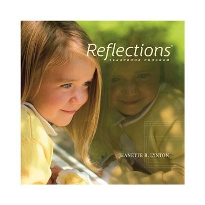
This week our challenge was to "Sketch It Out"... and we were instructed to use either the provided layout sketch the provided card sketch.  I chose to do the Layout Sketch, which you can find on page 46 our Reflections How To Program Pattern Books!  The pattern is called Sidebar-Photo Accent... and I chose to do the alternative layout.


Here is a close look:

The thing I love about our How To books is that if I am limited in time, I just browse through the book, find some layouts that work with the photos I have chosen and then just follow the pattern, which provides cutting directions to make the most of your paper, as well as suggestions for alternative layouts.  It even shows sample completed layouts!  I knew I wanted to showcase the many years of friendship between my daughter and her best friend, so I loved this layout choice as I was able to fit 5 photos on a single page layout!  This layout literally took me 1/2 hour to complete (including choosing and cropping the photos that I used).


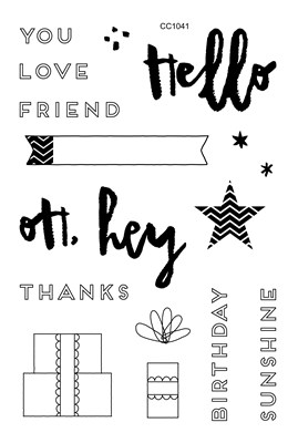
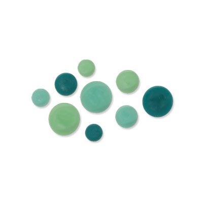
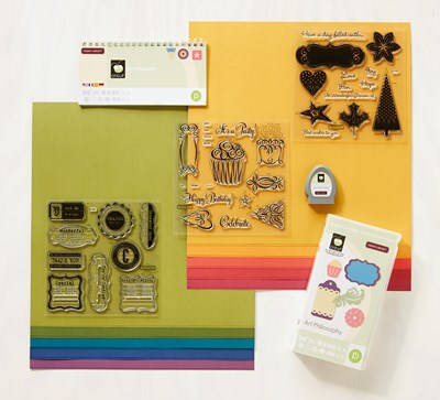
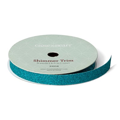
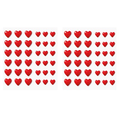
Since there are many different colors in the photos, I chose to use the new Peacock Blue as the base, with Black photo mats so the photos would pop.  I added Champagne Paper Fundamentals (The one I used is now retired but we do have a new version available) between the photo and the mat.  Some of the photos have red / pink in them so I chose a strip of retired Claire paper to bring out some of the colors in the photos!  I added a strip of Teal Shimmer Trim to match the "Good Times" sentiment that I found in our new Instalife Card Collection - Colorful Me.  I finished it off with a few Red Enamel Hearts to add a little bit of pop on the left side of the page. 

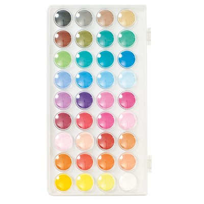
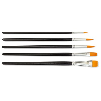
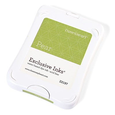
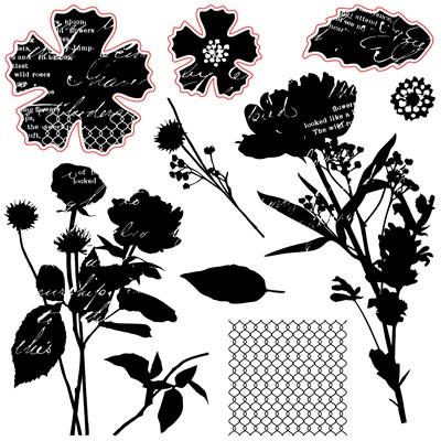
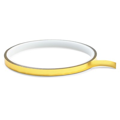
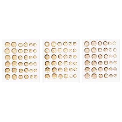
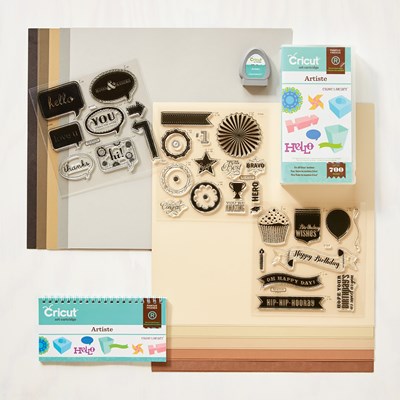
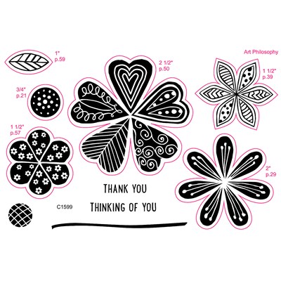
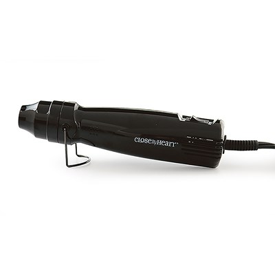
Products used in this project are as follows (click on the photo for availability of product):


Don't forget to check out the inspiration from the other designers over at Between The Folds Weekly Challenge... we hope you will play along!


Tuesday, September 22, 2015

Live Life In Color... which is easy to do when you add a little watercoloring!

This project was prepared for our challenge on Between The Folds, which is a Close To My Heart Weekly Challenge Blog!  Every Tuesday we will be choosing themes that will challenge your creativity!  We hope you play along!

This week our challenge was to use watercolor in a project and I chose to use our new watercolor paints!  I have to admit, I have never used them before and I was a little intimidated.  I decided to do a greeting card, and had so much fun, I decided to try another one! I can't wait to practice some more and I love that I can add color to any project so easily!  I decided to use the Hello Life - Cardmaking Promotional Stamp Set made for National Stamping Month.


The first card I did was the one on the right... I love how the white embossed image is resistant to the watercolor.  I was not as happy with the "friend" in purple, so I decided to try it again using silver embossing powder instead of white and stamp "friend" with ink after the watercolor was dry.  Much more vibrant, but I do love the variation in color I got adding the purple.

Here is a close look:


I stamped and heat embossed the Hello FRIEND using White Pigment Ink and White Embossing Powder.  The top layer of the card is a piece of Watercolor Paper.  The Peacock Cardstock underneath is embossed with our new Confetti Stars Embossing folder used in my Cuttlebug.  I wanted to give it even more texture so I sanded it to show the white core of our awesome cardstock!  I added a few 


The idea for this one was the same, but I used Silver embossing powder on the Hello.  I waited until the watercolor paper was dry and stamped FRIEND with Peacock Exclusive Ink.  I also added a Sweet Leaf (green mat) and some Silver Foil Tape to bring out the silver in the sentiment. 

Products used in this project are as follows:
Hello Life - Cardmaking

Watercolor Paints
Paintbrush Set
Watercolor Paper
Peacock Exclusive Cardstock
Sweet Leaf Exclusive Cardstock
Confetti Stars Embossing Folder

White Cards and Envelopes
White Daisy Exclusive Ink
Ranger White Super Fine Embossing Powder
Ranger Silver Super Fine Embossing Powder
Enamel and Glitter Duos Purple Hearts 
Silver Foil  Tape
Don't forget to check out the inspiration from the other designers over at Between The Folds Weekly Challenge... we hope you will play along!


Monday, September 14, 2015

Go ahead and Quote me on that!!!

This project was prepared for our challenge on Between The Folds, which is a Close To My Heart Weekly Challenge Blog!  Every Tuesday we will be choosing themes that will challenge your creativity!  We hope you play along!

This week our challenge was to add a quote to your project!  I love quotes!  I often incorporate them into my layouts and build my page around the quote!  I decided on the one I used because when I read it, it reminded me of my daughter.  I just love the young lady she has become and she really does put the "wonderful" into the world... at least my world!


The adorable quote card came from one of our new Picture My Life Pocket Scrapbooking Kits, Beautiful You.  The classy black and white pattern paper is from the new La Vie En Rose Paper Pack.  I decided to combine it with the September Stamp Of the Month, Paper Garden to add just a pop of color!  Since my daughter's favorite color is purple, I chose Gypsy.  I added a little strip of the new Gold Foil Tape to match the gold on the card.

Here is a close look:

From the moment I saw the September Stamp of the Month Artwork, I was in love with the stamp set and the sample layout.  I just switched up my colors and changed a few things and voila!  I wanted the focus on the quote, so I added less flowers than the original sample shown below.  I love this stamp set even more after using it.

fpo

If you have not tried Pocket Cards in your projects, I urge you to give it a try!  Our new cards now come with the same image on the front and back of the cards, but it is horizontally on one side and vertically on the other!  No more wishing it was the other way!


I love the second generation stamping image you get with this stamp set.  Combined with the vibrant color of the flowers and the leaves, it looks beautiful.  I topped it all off with some Gold Sequins!  I love how this layout turned out.


Products used in this project are as follows:

CTMH Exclusive Cardstock Colors: Gypsy


Beautiful You Picture My Life

La Vie En Rose

Gypsy Exclusive Ink

Pear Exclusive Ink

Paper Garden

Gold Foil Tape

Sequins Gold Assortment

Cricut Artiste

Don't forget to check out the inspiration from the other designers over at Between The Folds Weekly Challenge... we hope you will play along!


Tuesday, September 8, 2015

Embossing with Black and White

This project was prepared for our challenge on Between The Folds, which is a new Close To My Heart Weekly Challenge Blog!  Every Tuesday we will be offering themed challenges that will challenge your creativity!  We hope you play along!

This week our challenge was to add some type of embossing to your project!  I really took my time with this one and found a new appreciation for embossing powder and my heating tool in the process! I absolutely love how this layout turned out.  I just ordered one of our Shadow Box Frames so I can frame it and put it in my office!


I really wanted to do a classic black and white layout, but when I started planning my page, I decided I wanted a little bit of color.  I love the classy look of the Glacier Paper Fundamentals (now retired), so I used that as my base page.  I accented with Lagoon to give it a brighter, but still subtle pop of color... and finished it off with some Lagoon colored enamel Aqua Dots (and some black gems, now retired).

Here is a close look:
To get the effect above, I stamped the Pretty Petals coordinating stamp on the image cut using the Art Philosophy Cartridge.  Added some white embossing powder and used heating tool to set.

To get the frosted look on the tips of the roses, I rolled the cut pieces to form the roses, held them and dipped the tips in white ink, followed by white embossing powder and then used heating tool to set.

To get the shaded embossed look on the butterfly, I used Lagoon paper (with black as the base) and just pressed the top layer of the butterfly into the ink, followed by embossing powder, followed by the heating tool!  Love how it turned out.  The heat embossing adds that hard enamel look, so it looks like the butterfly is popping off the page.

You can see I also quickly dipped the edges of the smaller black flowers in ink, powder and embossed!  

I hope I have inspired you to get your embossing tools and heating tool out!


Products used in this project are as follows:

CTMH Exclusive Cardstock Colors: Black and Lagoon

Pretty Petals
White Daisy Pigment Ink
Ranger White Embossing Powder
Aqua Dots

Craft Heater

Art Philosophy Cricut Collection

Don't forget to check out the inspiration from the other designers over at Between The Folds Weekly Challenge... we hope you will play along!